Functional VS Imperative

Which is easiest to learn, functional programming or imperative programming? Here's my two cents.
newestblogpost
Lorem ipsum dolor sit amet, consectetur adipiscing elit. Sed id accumsan lacus. Aliquam maximus metus ante, at euismod justo vestibulum ut. Curabitur ut metus neque. Pellentesque at est feugiat, mollis tellus vitae, elementum orci. Nulla scelerisque eros vitae mauris consectetur vehicula. Vestibulum vitae dictum nisl. Mauris non turpis mattis, viverra orci egestas, ullamcorper sem. Nunc viverra ex nunc, sit amet tempus ipsum faucibus rutrum. Sed sit amet mollis nunc. Nam sit amet est lacus.
Sed vitae interdum nulla. Cras viverra blandit eleifend. Donec eget odio augue. Pellentesque eleifend fringilla consequat. Sed mi turpis, semper quis tellus at, placerat suscipit mauris. Etiam nec lacinia lacus. Curabitur nunc mi, sollicitudin vel fringilla ac, malesuada a erat.
Etiam in metus ac diam sodales scelerisque. In tincidunt, sapien eget vulputate egestas, libero augue placerat mauris, ac viverra massa lacus fringilla nisl. Sed tempor orci vel sapien feugiat, nec dictum neque lacinia. Donec viverra at nisl at porta. Praesent vel porta diam. Nulla erat ex, lobortis non metus nec, convallis ullamcorper ipsum. Nunc fringilla vitae ligula vitae cursus. Aenean tincidunt suscipit ultricies. Nullam sodales nunc pharetra egestas tempus. Fusce ipsum diam, rhoncus id risus id, sodales tincidunt tortor. Nullam egestas vehicula nisl et consectetur. Phasellus ullamcorper, velit ut congue euismod, est velit lobortis nulla, eu tristique odio ante gravida nulla.
Cras ullamcorper est in risus consequat vestibulum. Aenean eget lorem eu nibh volutpat porttitor pharetra sed mauris. Vestibulum auctor est vitae nisi vestibulum, tincidunt fermentum sem molestie. Maecenas et scelerisque dui, sit amet dapibus odio. Sed vel euismod turpis. Maecenas feugiat est vel justo tincidunt, vel sollicitudin velit iaculis.
It doesn't happen often, but sometimes I have something useful to share with the world. You can read about those things in my blogposts.
Which is easiest to learn, functional programming or imperative programming? Here's my two cents.

More and more people think that AI will kill the web. I rather think the opposite.

What is the correct way of doing nothing? Here is an explanation of synchronous programming VS asynchronous programming when it comes to waiting.
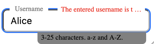
How should a good input component function?
How should a good input component function?
Loading...
Lorem ipsum dolor sit amet, consectetur adipiscing elit. Sed id accumsan lacus. Aliquam maximus metus ante, at euismod justo vestibulum ut. Curabitur ut metus neque. Pellentesque at est feugiat, mollis tellus vitae, elementum orci. Nulla scelerisque eros vitae mauris consectetur vehicula. Vestibulum vitae dictum nisl. Mauris non turpis mattis, viverra orci egestas, ullamcorper sem. Nunc viverra ex nunc, sit amet tempus ipsum faucibus rutrum. Sed sit amet mollis nunc. Nam sit amet est lacus.
Sed vitae interdum nulla. Cras viverra blandit eleifend. Donec eget odio augue. Pellentesque eleifend fringilla consequat. Sed mi turpis, semper quis tellus at, placerat suscipit mauris. Etiam nec lacinia lacus. Curabitur nunc mi, sollicitudin vel fringilla ac, malesuada a erat.
Etiam in metus ac diam sodales scelerisque. In tincidunt, sapien eget vulputate egestas, libero augue placerat mauris, ac viverra massa lacus fringilla nisl. Sed tempor orci vel sapien feugiat, nec dictum neque lacinia. Donec viverra at nisl at porta. Praesent vel porta diam. Nulla erat ex, lobortis non metus nec, convallis ullamcorper ipsum. Nunc fringilla vitae ligula vitae cursus. Aenean tincidunt suscipit ultricies. Nullam sodales nunc pharetra egestas tempus. Fusce ipsum diam, rhoncus id risus id, sodales tincidunt tortor. Nullam egestas vehicula nisl et consectetur. Phasellus ullamcorper, velit ut congue euismod, est velit lobortis nulla, eu tristique odio ante gravida nulla.
Cras ullamcorper est in risus consequat vestibulum. Aenean eget lorem eu nibh volutpat porttitor pharetra sed mauris. Vestibulum auctor est vitae nisi vestibulum, tincidunt fermentum sem molestie. Maecenas et scelerisque dui, sit amet dapibus odio. Sed vel euismod turpis. Maecenas feugiat est vel justo tincidunt, vel sollicitudin velit iaculis.